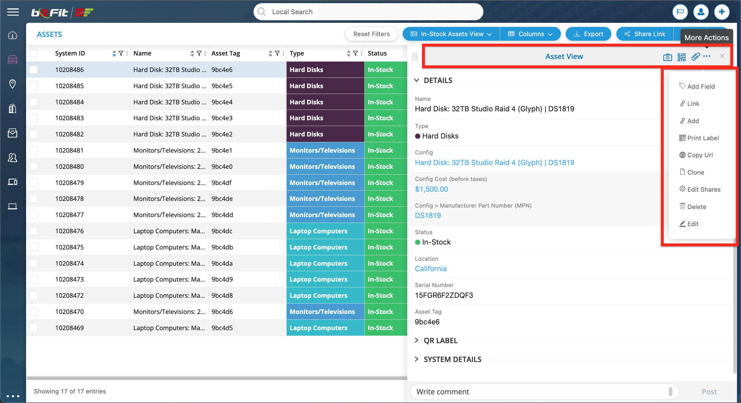
WHAT IS A DETAIL CARD?
A Detail Card serves as a side panel that can be accessed by clicking anywhere on a record’s row.
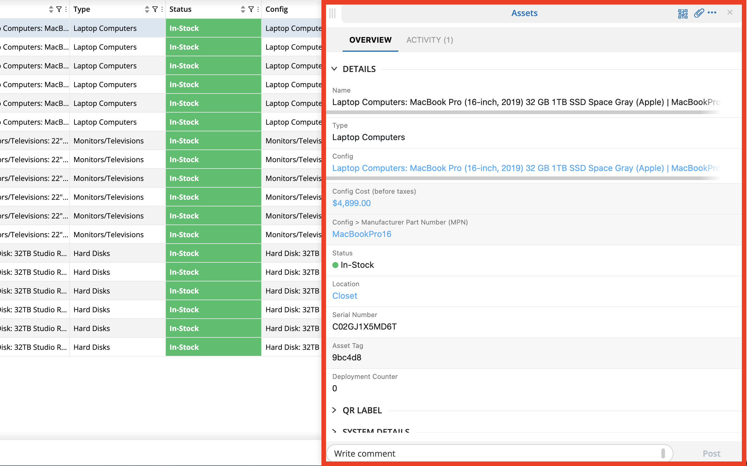
It consists of the top header block, which features read-only values and an image …
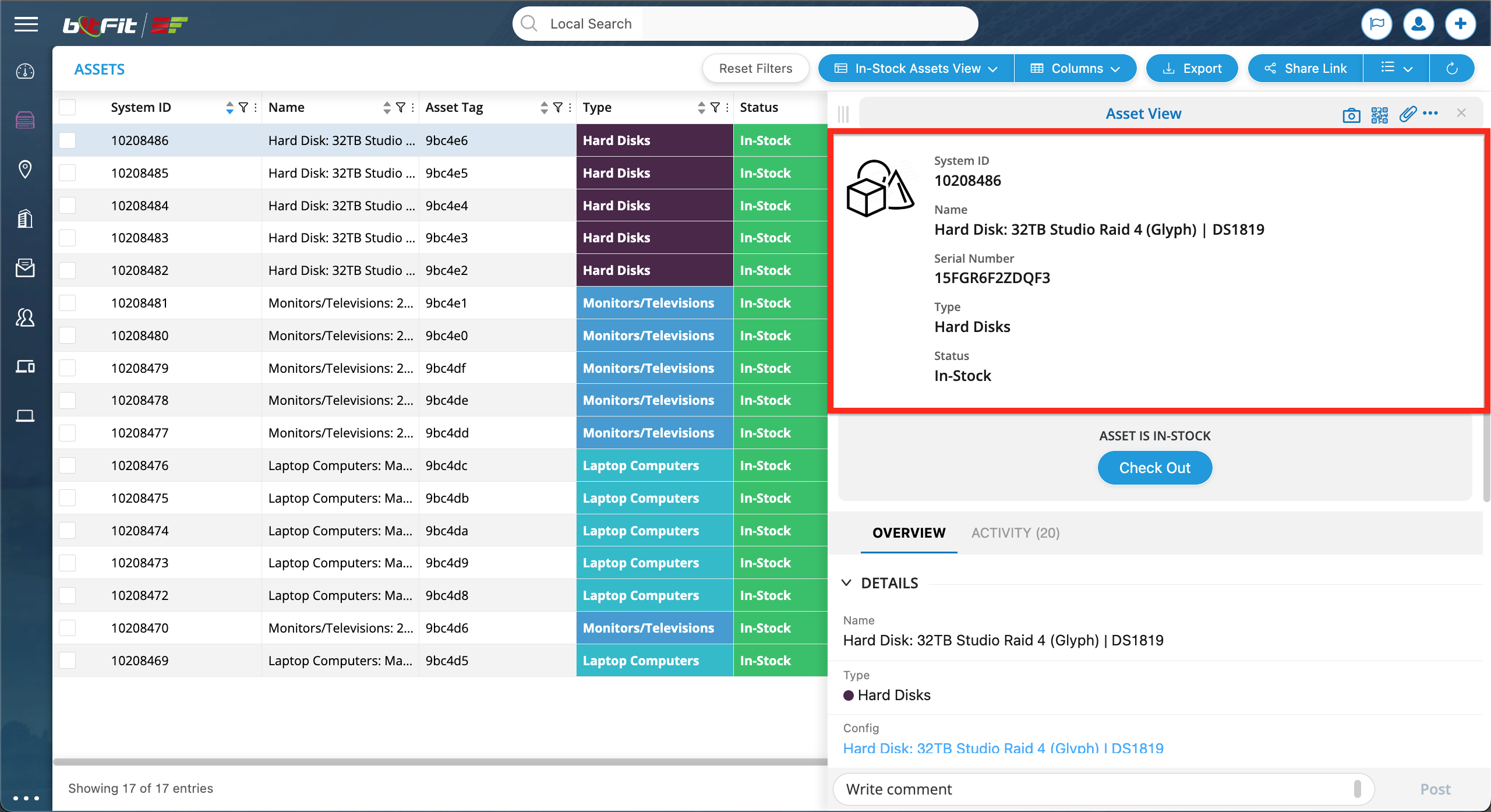
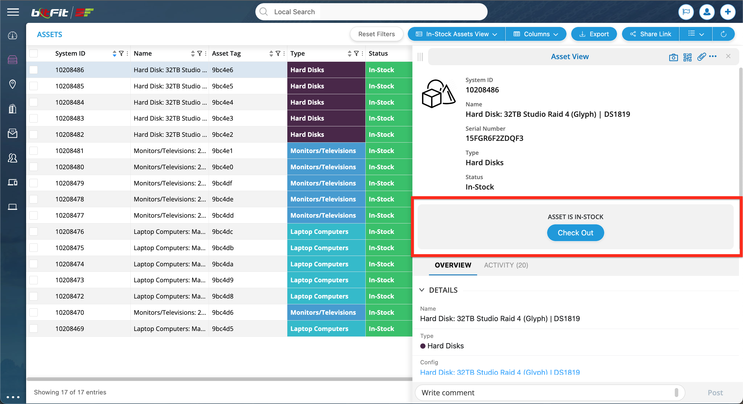
… followed by the Action Buttons block, offering options like Check Out or Check In …
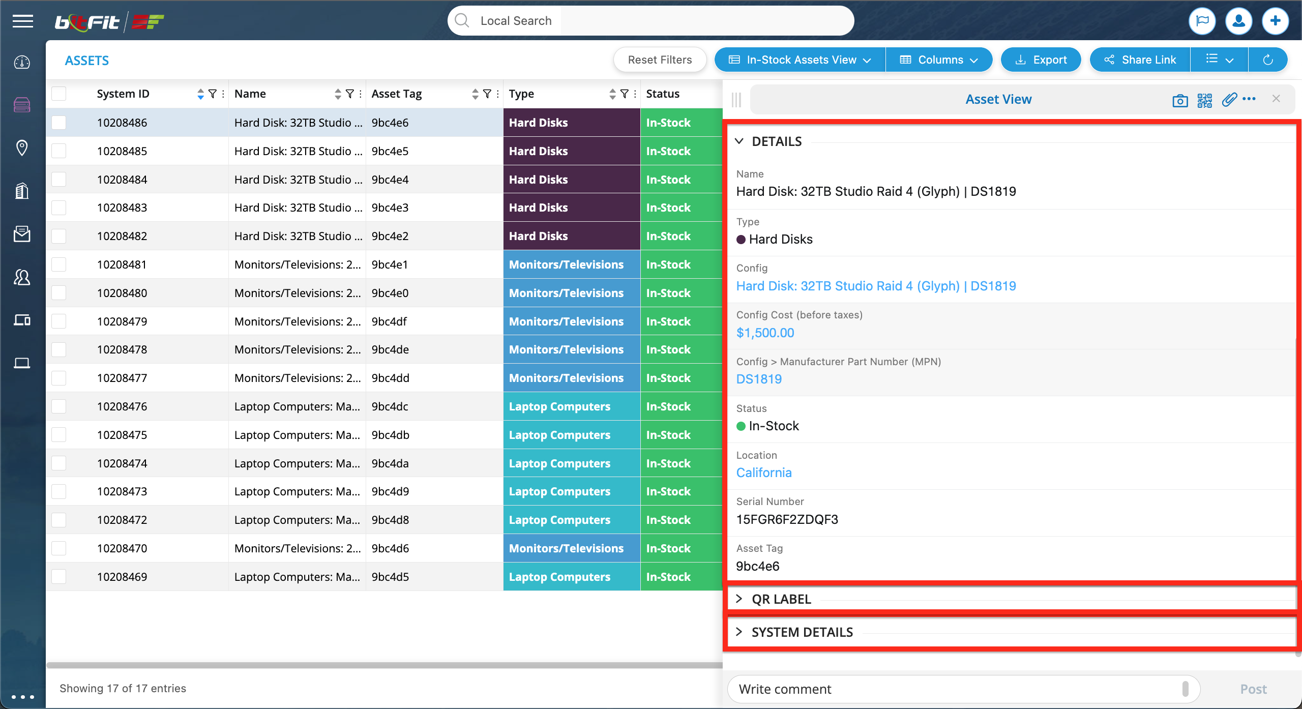
… editable fields, organized into sections (DETAILS, QR LABEL, SYSTEM FIELDS) …
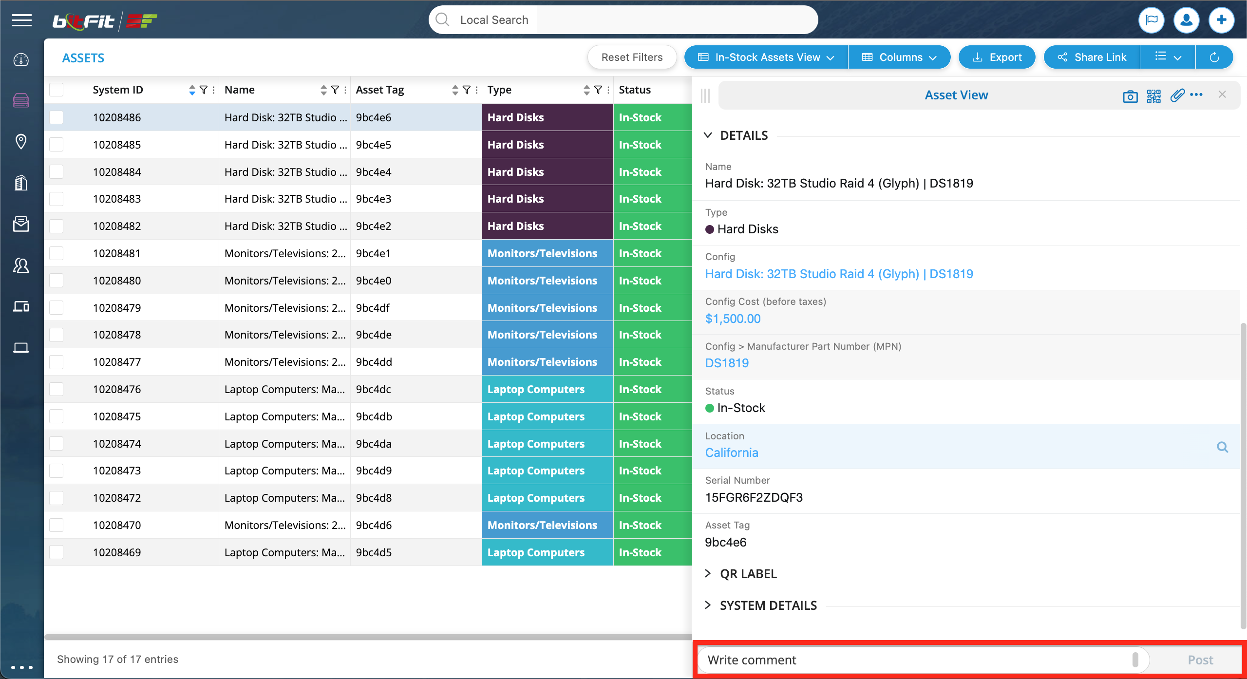
… and the comments block, that can be used as a chat.
Moreover, at the top of each Detail Card, additional actions are available, such as viewing all photos, attaching files, printing QR labels, editing a record, cloning a record, and more.
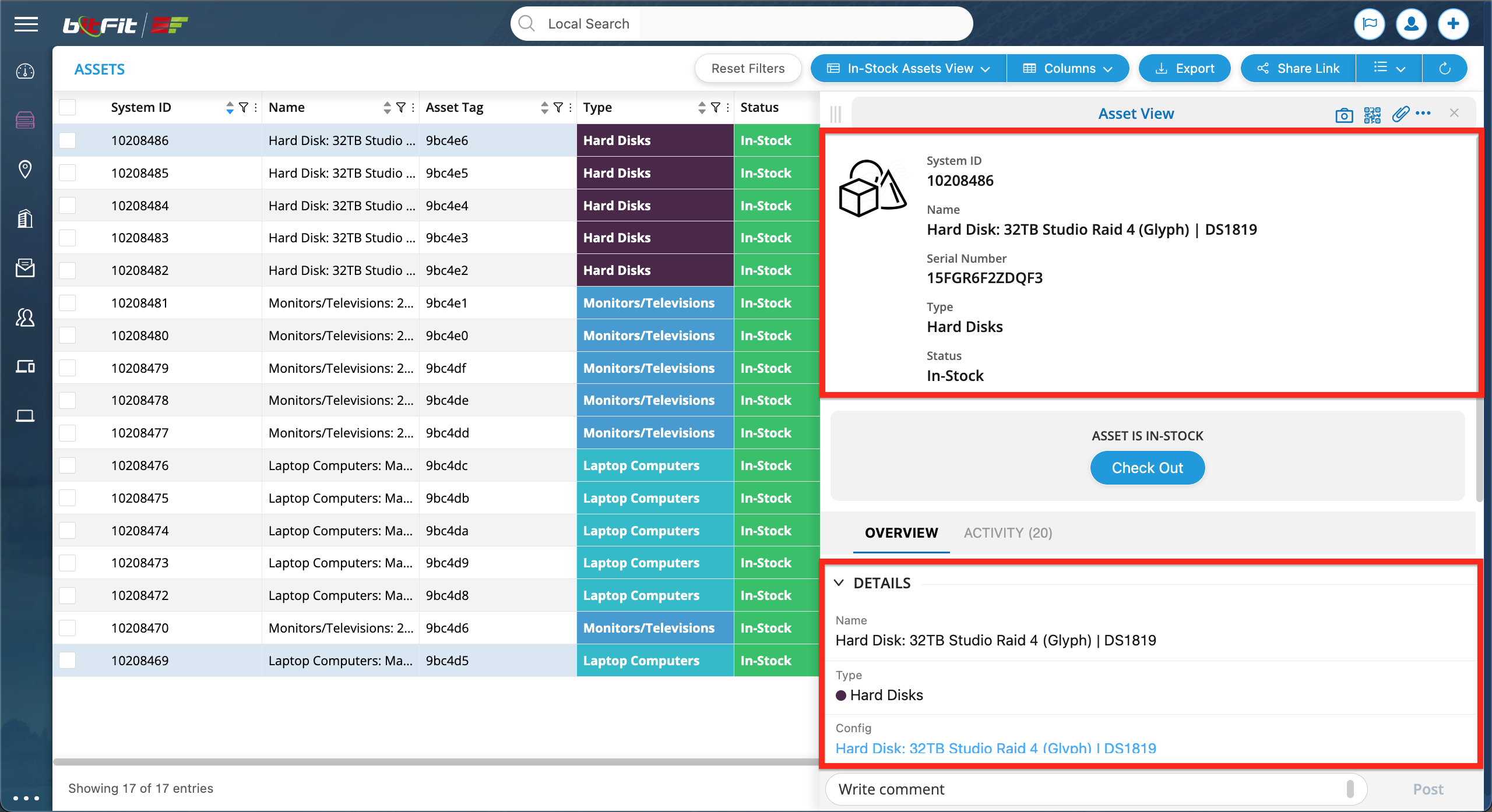
WHAT IS A DETAIL CARD VIEW?
The Detail Card View merges the top section with read-only fields and the bottom section containing editable fields.
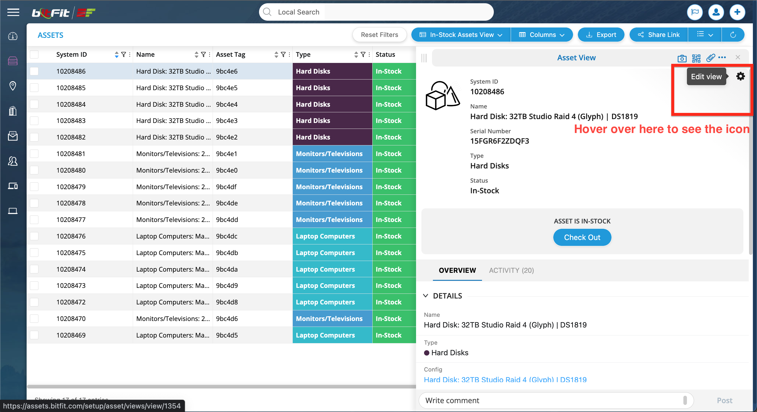
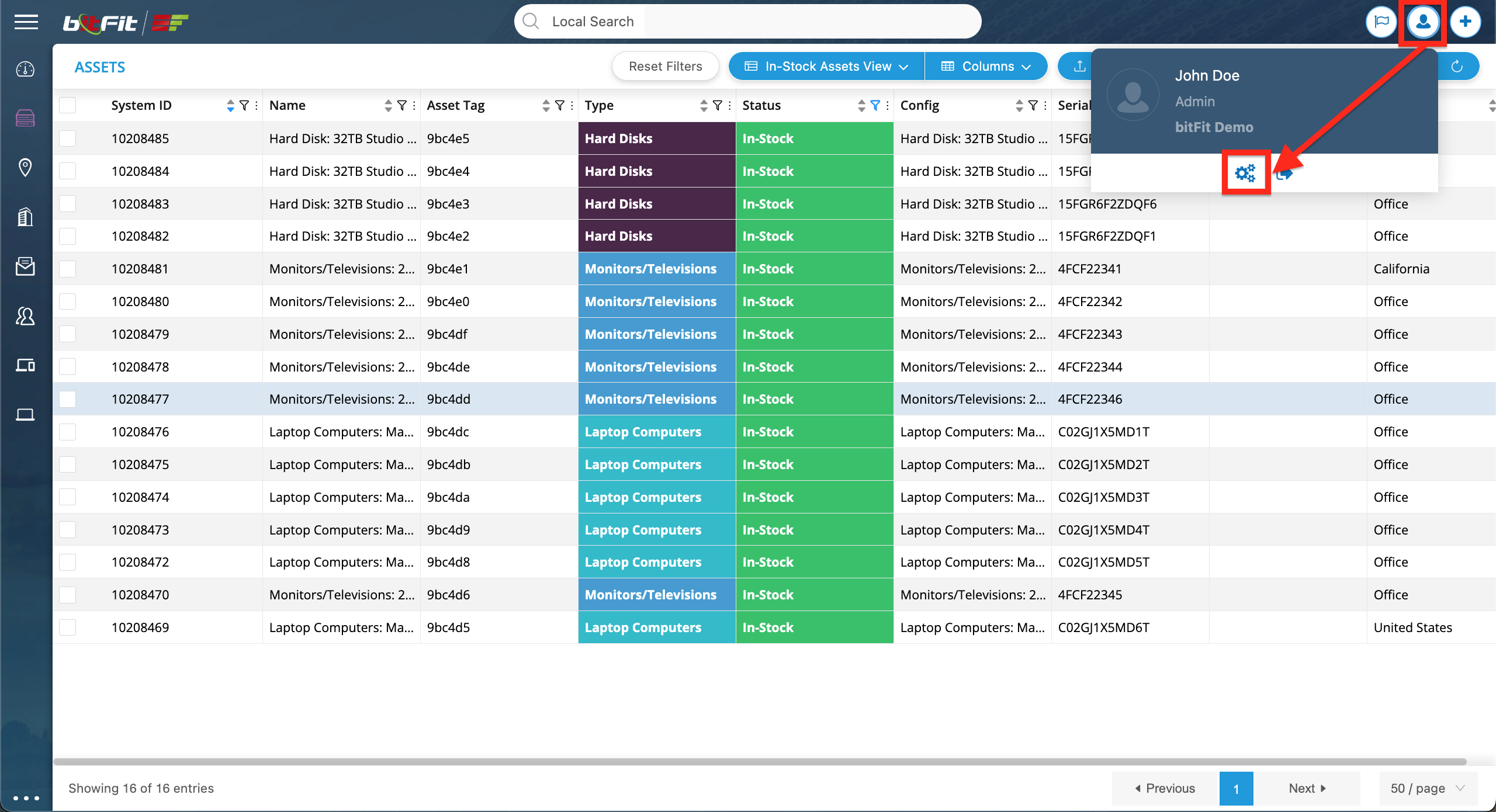
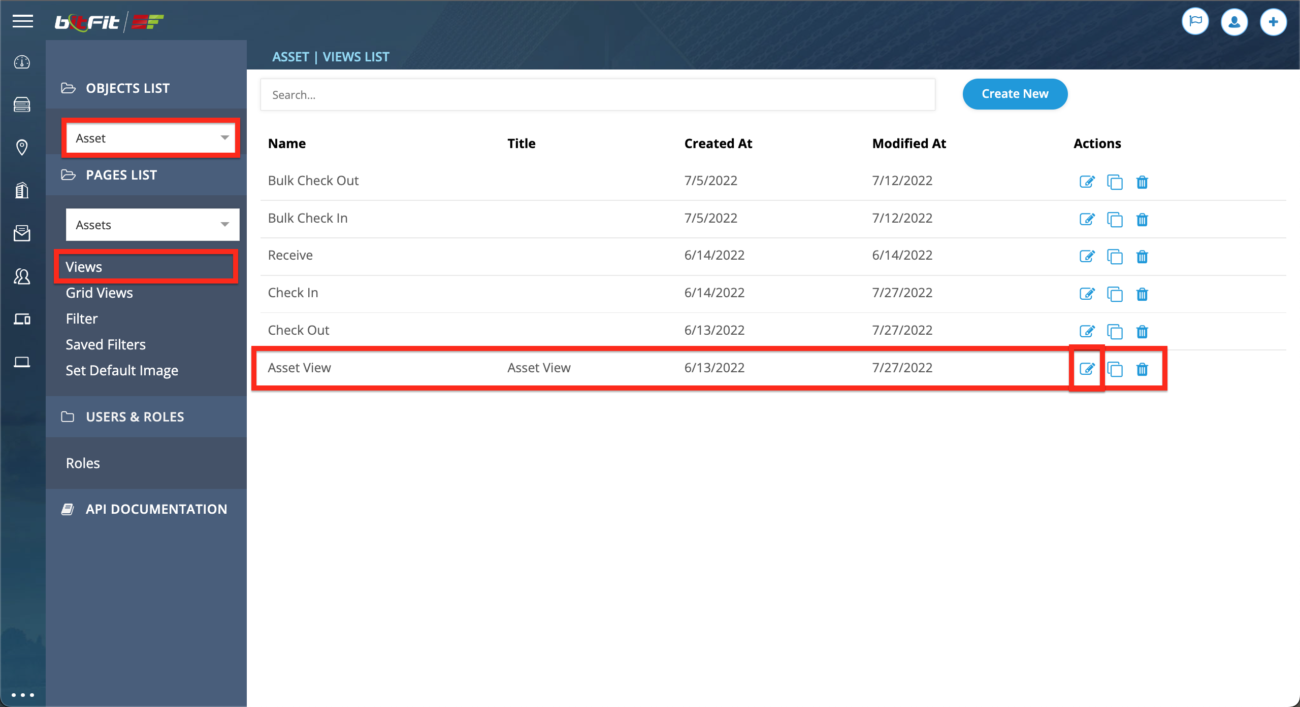
HOW TO UPDATE A DETAIL CARD VIEW?
There are two ways to access the Detail Card View Builder. The first method is to hover over the top right corner in the Detail Card top header section, revealing an icon, and then click on that icon.
The second option is to click on the user icon and then the cogs icon to open the Setup, and from there, navigate to this view.
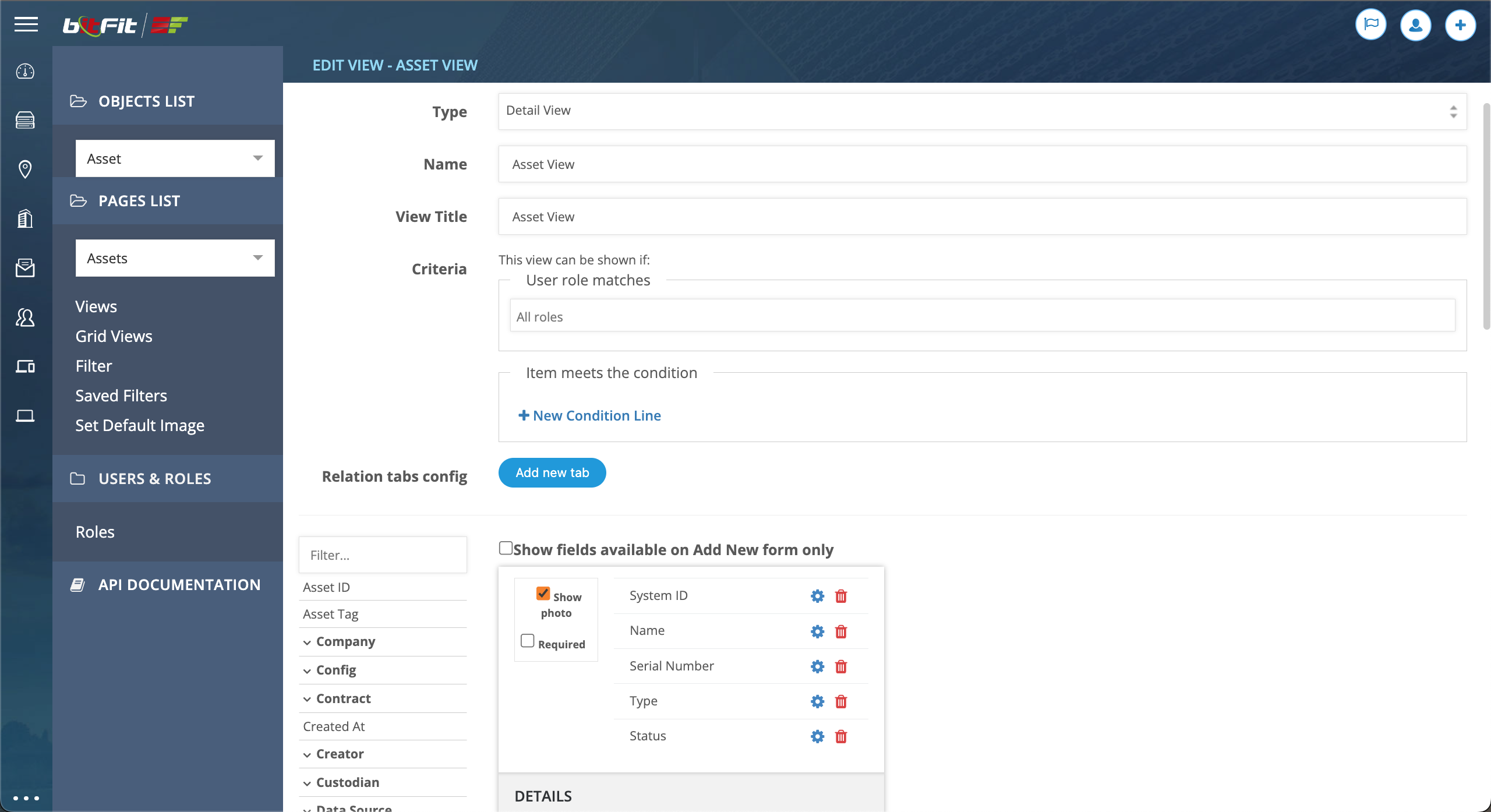
DETAIL CARD BUILDER EXPLAINED
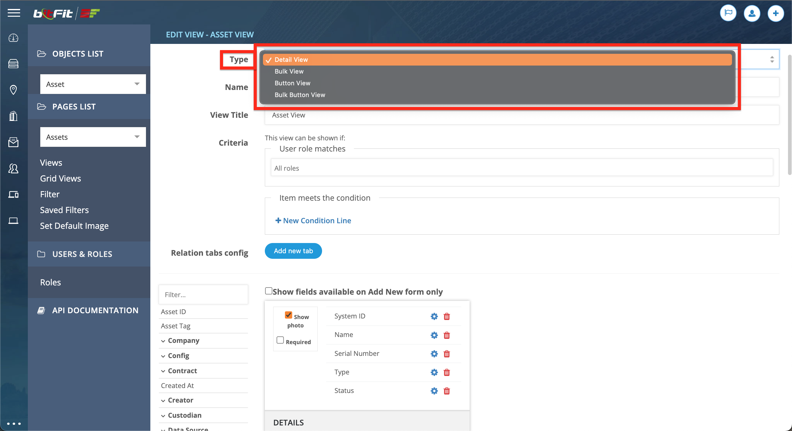
- Detail View: this type is used to configure the Detail Card (side panel) fields.
- Bulk Button View: this type is used to configure the popup form on the Bulk Check Out and Bulk Check In pages.
- Button View: this type is used to configure the Action Buttons’ popup form fields.
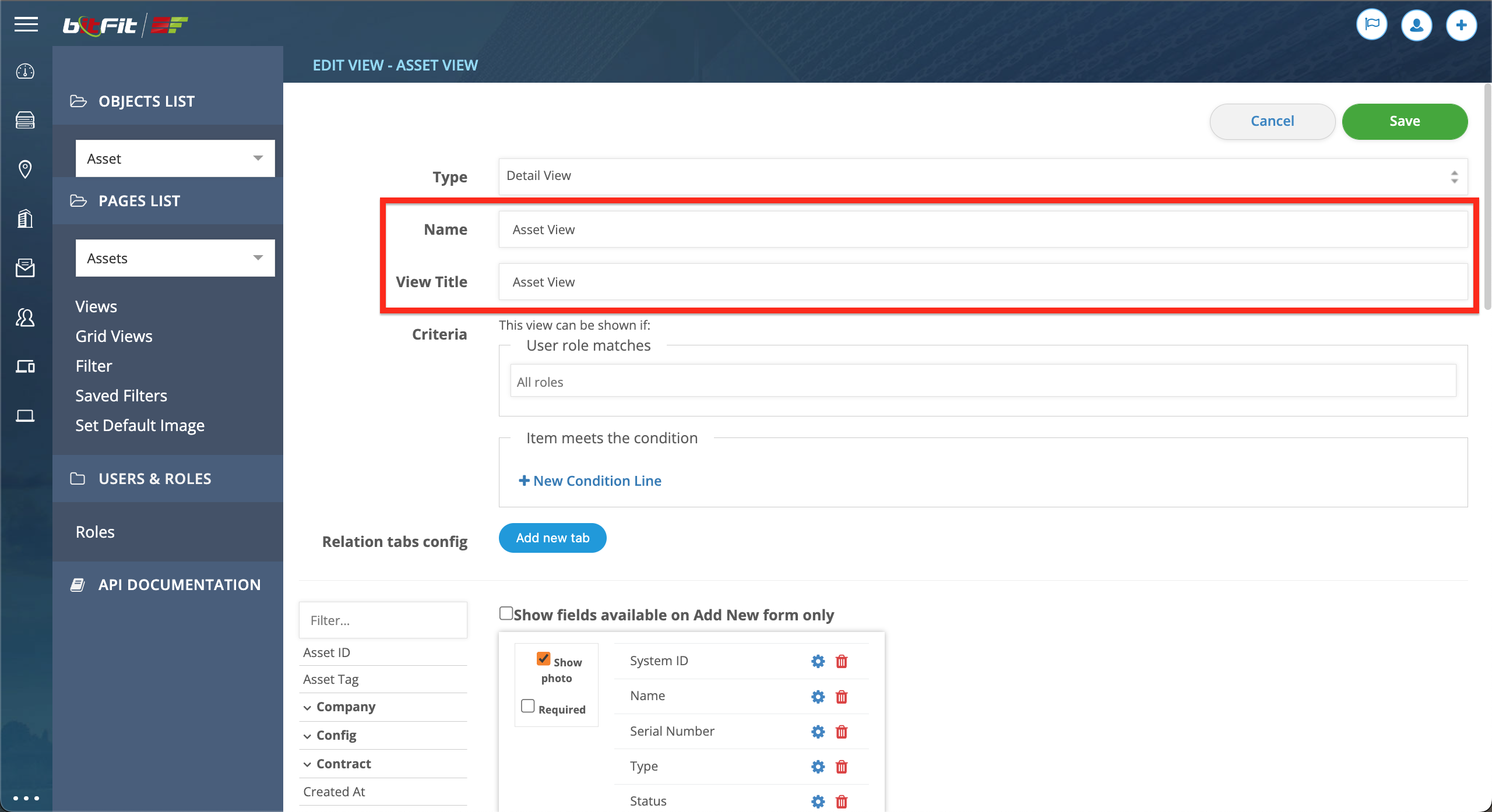
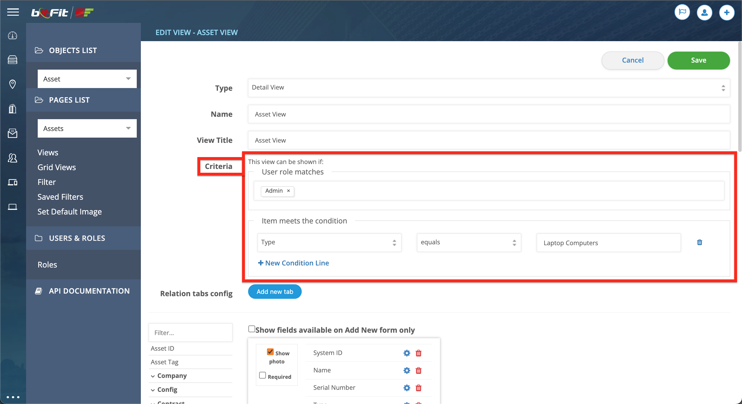
Name and View Title are used to provide labels to this view.
Criteria are utilized to establish conditions for displaying this view. For instance, a view can be made visible only to users with specific roles or under certain conditions, such as when the Type equals Laptop Computers.
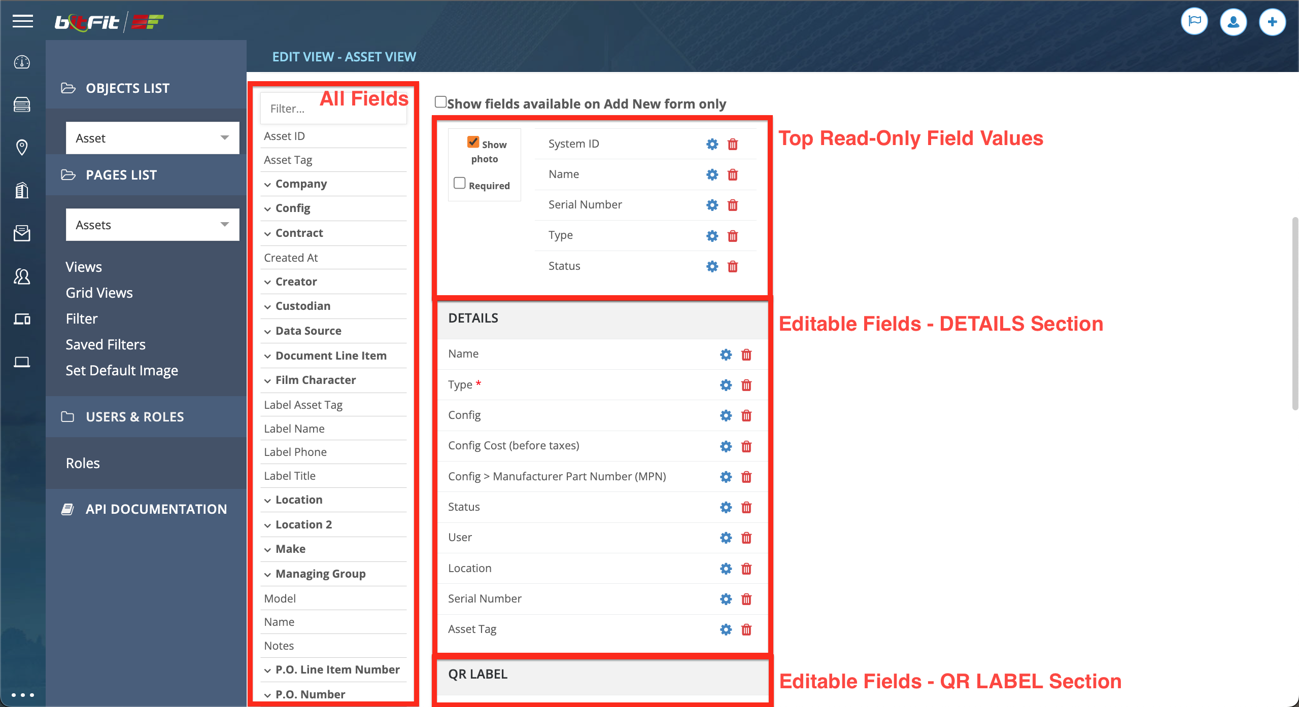
Moving down, the Builder itself is located. On the left side are all Assets’ fields, and on the right side is the builder with the top block containing read-only field values and image configuration, and the bottom block containing all editable fields sections.
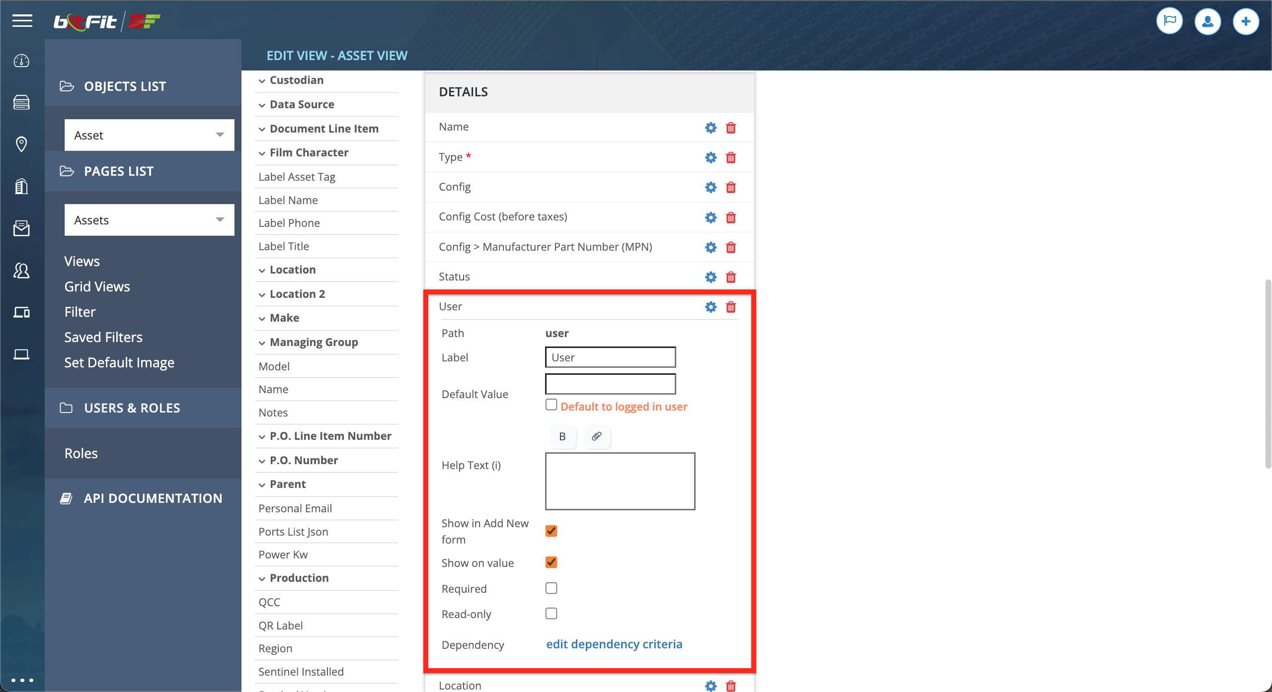
Each field offers multiple options. First, there’s the option to change a label if it’s different from the default one. Then a Default Value can be set. Additionally, a Help Text can be provided. The Show in Add New form checkbox determines if this field needs to be included in the Add New form. Show on Value means that this field will be excluded from the Detail Card (side panel) if a record doesn’t have a value. Required is used to set this field to be mandatory. And Read-Only is used to make this field not editable. Further down, conditions can be applied, controlling this field’s visibility; for example, a field can be visible if Status equals In-Stock – for all other status values, this field will be hidden in the Detail Card (side panel).
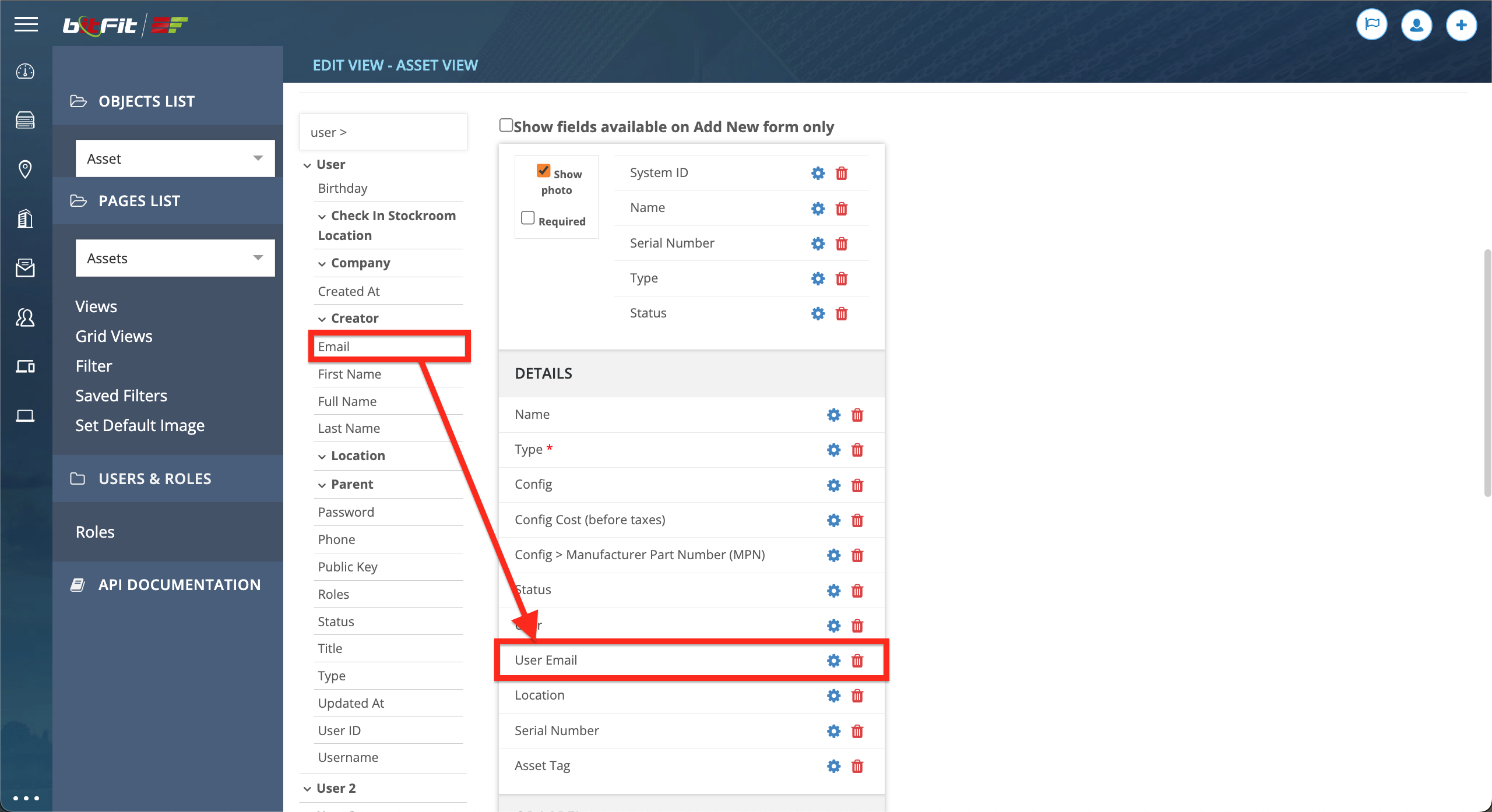
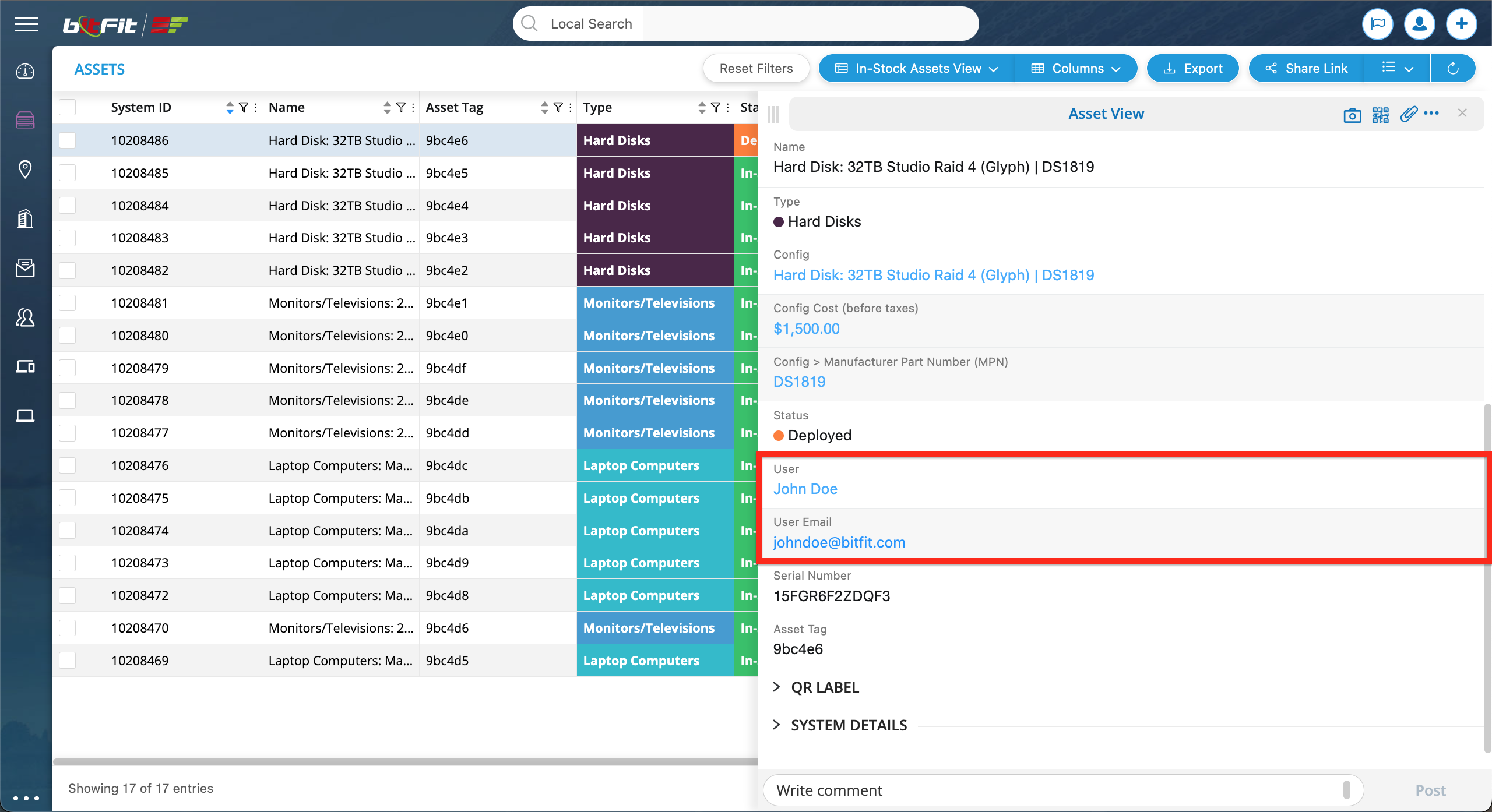
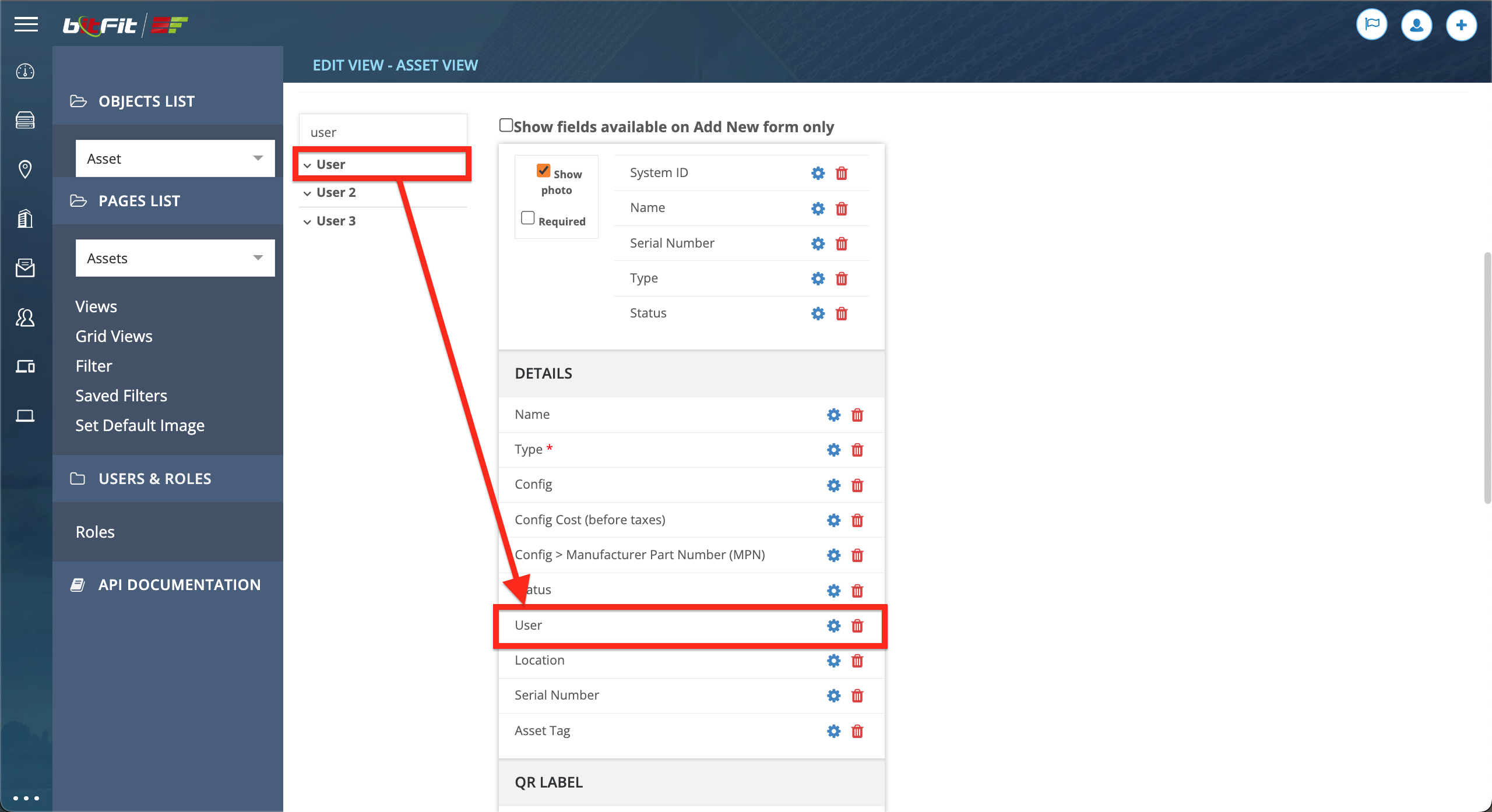
To add a relation field with the ability to update, simply drag and drop the desired bold field. For instance, if there’s a need to update a User.
If a specific value from a relation record needs to be added to a view, expand the bold field on the left side and then drag and drop the specific field. This field will be included in the Detail Card as a read-only link.